In my PhD project, I explored how to better understand and visualize complex data, which is particularly important for those of us working in data analytics. One big challenge in our field is dealing with uncertain or incomplete information, which is common with different types of data like maps or varied datasets.
To tackle this, I combined a method called Bayesian Networks, which helps deal with uncertainty, with visual analytics, which is all about making data easier to understand visually. My goal was to make it simpler for analysts to see patterns and relationships in data, even when that data isn’t perfect.
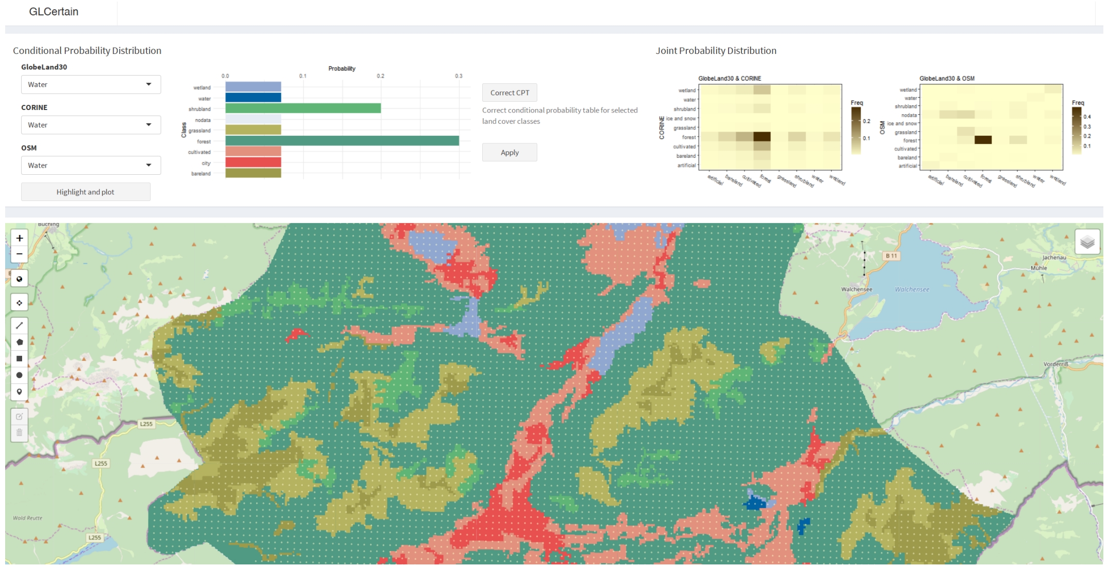
I worked on three main things: seeing if Bayesian Networks could help make sense of complex spatial data, using visual analytics to make knowledge retrieval easier, and creating a new tool that helps classify geographical data better.
I found out that Bayesian Networks are really useful for thinking through uncertain situations, but they’re not used much yet for looking at data in a way that we can see and touch. So, I made new visual tools that help combine maps and probabilities in one place, making it easier for people to interact with data directly.
I showed how this could work with two examples: one looking at different types of land and another with video surveillance data. While there’s more work to be done, especially in making these tools easy for everyone to use, my project opens up new ways for data analysts to work with uncertain information, making our analyses more robust and understandable.
